I had the pleasure of helping my good friend Erin with some of her wedding stationery. She has fabulous taste and it was a wonderful collaboration all around.

We started off with the save the date. She came up with the concept and I designed it. The pictures were taken by Erin and were representative of each stage in their relationship. They met at the beach, the piano bar is one of their favorite date night spots, the heart cloud is a picture from a vacation in Paris and the bench is in the park where Matt proposed. Erin had them printed and on semi glossy paper and cut at Staples and we rounded the edges with a paper punch.
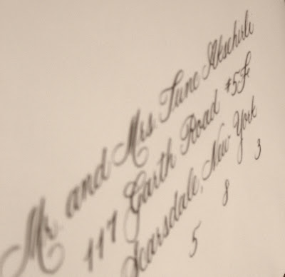
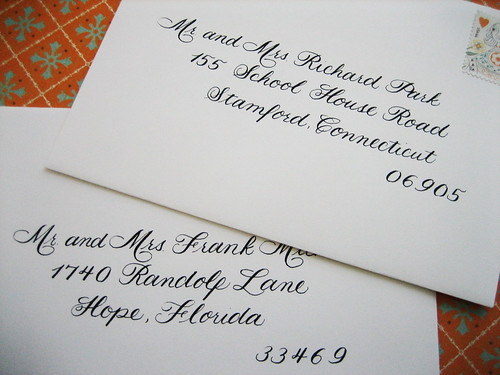
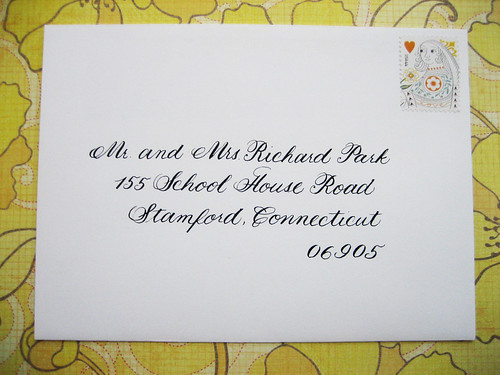
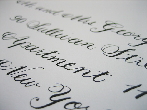
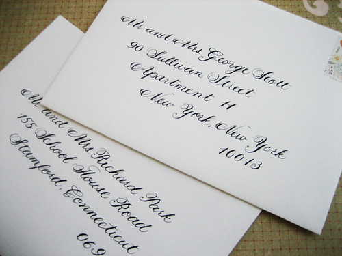
A few months later I did Erin's wedding invitation calligraphy. She wrote a cute post about it
here.
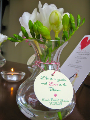
We threw the bride-to-be a bridal shower and I created the favors: cute bud vases with a personalized tag.
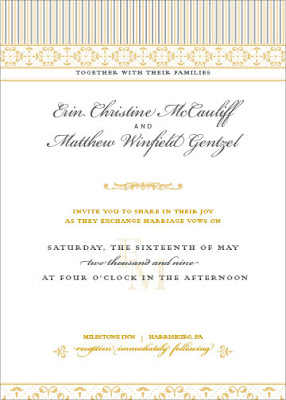
Her cousin, Robbie, designed the beautiful wedding invitations and we carried the theme throughout.
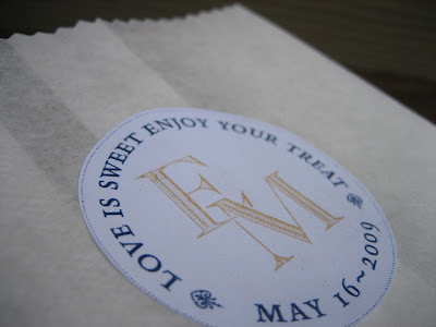
I created the goodie bags for the wedding favors by designing a sticker from the monogram Robbie designed on the invitation. They were printed on adhesive paper and punched out with a round 2 inch hole punch. We stuck them onto white paper bags and trimmed the top off with pinking shears to give it a finished edge.

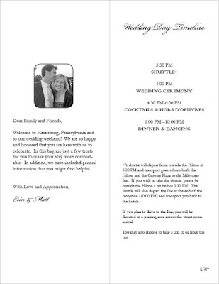
Finally I designed the wedding program for the hotel bags. The cover was based off of the invitation and we used the same fonts. We printed them double sided on 8 1/2 by 11 and folded them in half vertically.
Having a consistent theme through colors, fonts and designs ties all the special elements of a wedding together. It is an easy way to make your wedding memorable and distinctive.
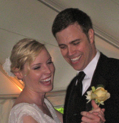
Congratulations Erin and Matt... it was a beautiful wedding!
 Picked in June Olive Oil, a boutique olive oil company in Australia. Designed by Watts Design. The photograph was taken on their property in central Victoria.
  Clover Farmstead Butter. Designed by Voicebox Creative. The label is pressure sensitive so it peels off easily so the crock can reused time after time. I love this. There's nothing worse than label residue left on containers. (Although this label is so pretty that I might just leave it on.)

 A set of 4 ornaments will be shipped to the winner. Ornaments come complete with hanging thread and adhesive patches to mount to them to your ceiling.
 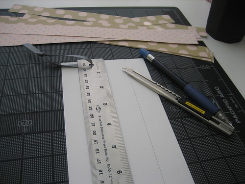 I started off by measuring and cutting 1" x 11" strips of Martha Stewart patterned paper.

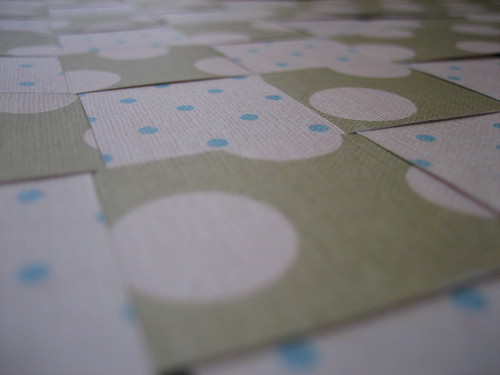 Then I wove the strips to make a basket weave pattern. Make sure to glue each strip together at the sides. Glue dots worked perfectly for this.
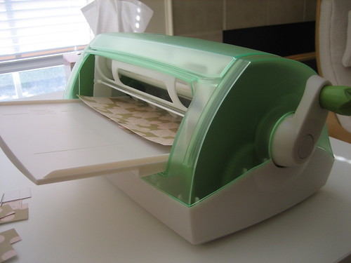 A quick zip through the Xyron machine... (the best invention ever!)
 to give it an adhesive backing.
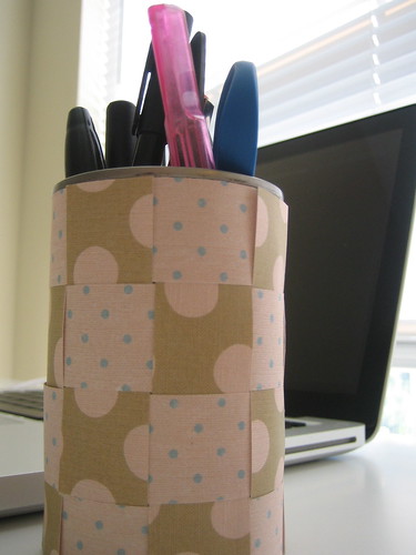


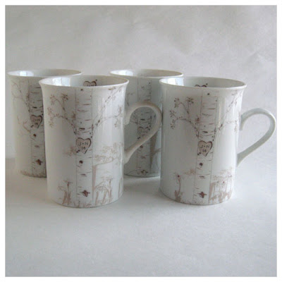 My favorite is her birch tree collection. I actually gave these mugs to my friend Erin for her bridal shower. Who wouldn't want their initials etched on a tree for forever?! (But in a non-tree hurting way.)
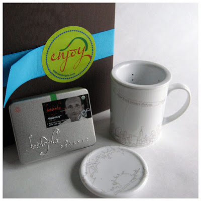 She also has wonderful tea gift sets of city skylines. At $28 each these are unique and affordable gifts.
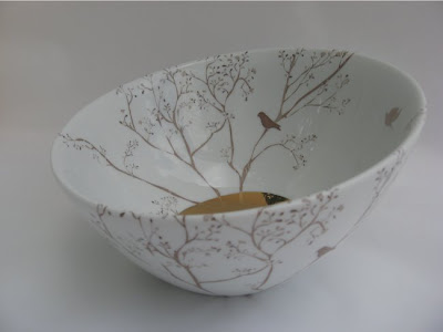 I'm absolutely in love with her Heart Bowls. The personalization is etched in to the gold a the bottom of the bowl. This might have to be a present to myself one of these days...
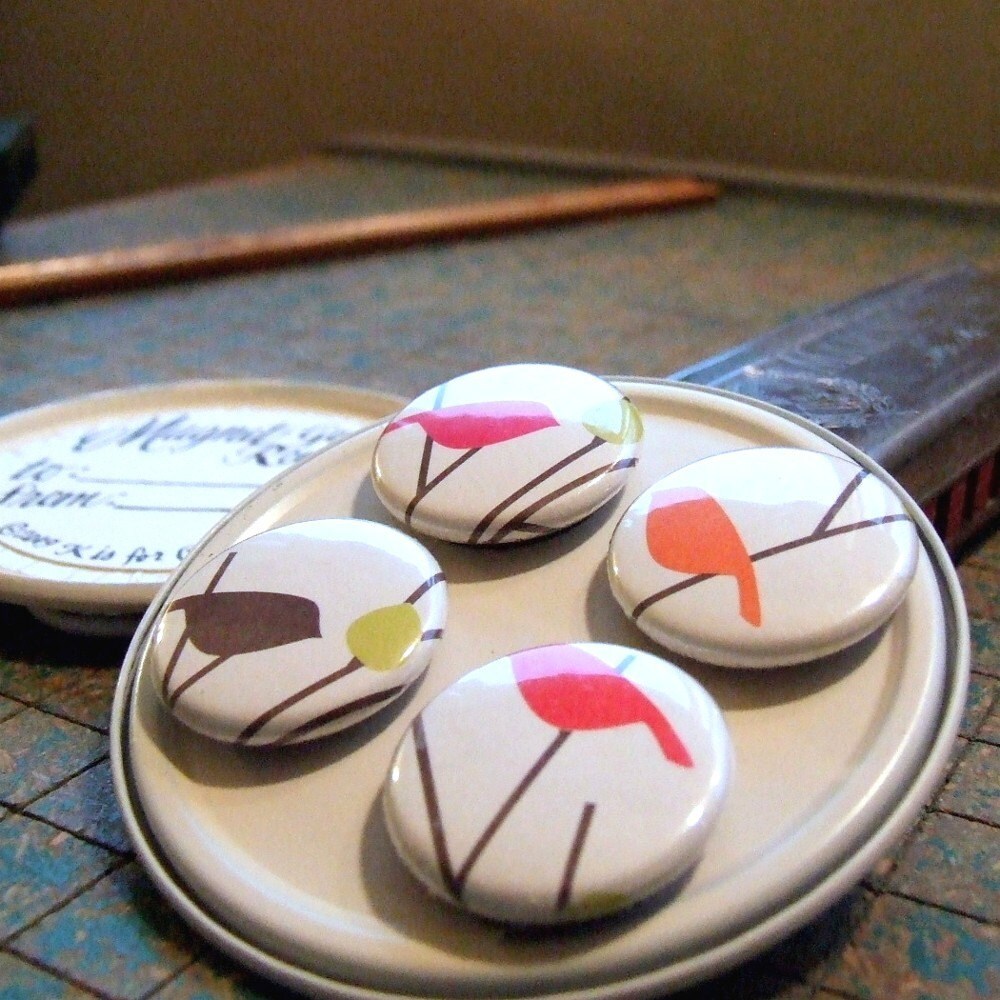
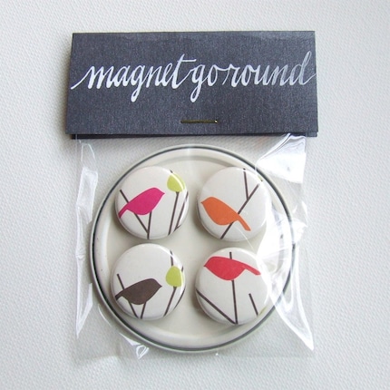 Unfortunately I can't take credit for Thrifty Post #2 but it was so good that I just couldn't resist sharing with you. Yesterday I was surfing Etsy when I found this wonderful store: K is for Calligraphy. I absolutely love her calligraphy and paper accessories. Everything is wonderfully packaged especially her magnet go-rounds. I've made a ton of magnets myself and the hardest part is packaging them so that they don't stick to each other and end up in a jumble. The little round disk that she used seemed to work perfectly. Turns out, the little round disks are the ends of the frozen orange juice containers that she had been saving for years. She just painted them white and added the hand calligraphed sticker on the other end. How clever is that?!