Friday, April 30, 2010
Navy Friday
Poor Navy has an ear infection this week so we had to break out the blow up collar so he won't scratch. It's quite hilarious.
Have a great weekend everyone! See you Monday!
Update on The Burren
The other day I asked for your votes for my sister-in-law and her family to win DIY and the TODAY Show's Desperate Landscape Contest. Well she has some great news... they made it to the top 10! DIY called Aideen and would like to see more footage of the front yard and they even asked her if she would be available on May 18th to be on the TODAY Show if she makes it to the final four. I couldn't be more excited for them! Thank you for your votes!
Thursday, April 29, 2010
I Own a Pneumatic Stapler
So I bought a pneumatic stapler on eBay for $38. And I'm not quite sure what I was thinking. Well, I was thinking, I don't want to spend $175+ to get my chair professional upholstered when I only paid $50 for it. But this very well worn stapler arrived in the box without directions and I don't even know if it works. So now I guess my next plan of action is to go to Home Depot and see if the tool people can test it for me before I go ahead and rent an air compressor.
And in case your wondering, this is what the chair looks like now. It has one coat of primer. I still need to add a second coat of primer and then paint it with Rust-Oleum Heirloom White spray paint. (Recommended by Centsational Girl.)
Hopefully I can re-upholster this without loosing a limb! I'll keep you posted.
Tuesday, April 27, 2010
Makin' Wine Bridal Shower
My friend Julie asked me to design some wine labels and tags for her sister's bridal shower. Everyone was asked to bring a bottle of wine for the bride and groom's wine cellar. Julie wanted to create tags so that the guests could write a personal note to Meredith and Jason.
I created the monogram and added "vintage 2004," when the couple met. Each tag was printed on cardstock and I used a 2" hole punch so that they could easily slip of the neck of a wine bottle. We used an autumnal color scheme to match their wedding colors.
And keeping with the theme, Julie's mom used empty wine bottles as vases. I created custom labels incorporating Jason's last name, Makin. But we had a little fun and added an apostrophe after it. I used my trusty Xyron machine to turn it into a sticker.
Monday, April 26, 2010
Potential Dining Room Ideas
You know by now that I'm completely obsessed with Sarah. Like, beyond obsessed. Whenever a new episode of Sarah's House comes on (HGTV, Saturday at 8:30pm) I literally jump for joy. I proceed to record it on DVR and then re-watch the episode several times until I've completely memorized the rooms and I take notes. Yes, notes like you would take in class. (Yikes, did I just say this out loud?!) Whatever she says, goes. So that's why I'm thinking about using a banquette with the dining room table in the new apartment.
The only problem is the Horchow settee is a little pricey. I found this Nate Berkus for HSN settee which is more affordable but it's not yellow and I don't completely love it.
I'm also inspired by Janell from Isabella & Max Rooms. She redesigned her living room to become her home office. I love that she used a round table and incorporated the couch with it.
So for tables, I'd like a walnut pedestal table. Janell used this table from Z Gallerie, which is gorgeous and cheaper than other furniture retailers.
American Simplicity Pedestal Table, $230
Above, all designs by Sarah Richardson
I found this amazing Paisley settee by Horchow. I like the size and love the high, rounded back. And the color works. I'm thinking of a cream and gray living room with hints of yellow so I would love to translate this over to the "dining area". (Note how I didn't say dining room. I know that our tiny NYC apartment won't have a dining room, but I'm at least hoping for some sort of space for dining. We really need to move beyond the coffee table.)
The only problem is the Horchow settee is a little pricey. I found this Nate Berkus for HSN settee which is more affordable but it's not yellow and I don't completely love it.
I'm also inspired by Janell from Isabella & Max Rooms. She redesigned her living room to become her home office. I love that she used a round table and incorporated the couch with it.
So for tables, I'd like a walnut pedestal table. Janell used this table from Z Gallerie, which is gorgeous and cheaper than other furniture retailers.
But since the Horchow settee is so expensive, maybe I should save and go with this Target table even though it's black?
American Simplicity Pedestal Table, $230
Any thoughts or suggestions?
Friday, April 23, 2010
Thursday, April 22, 2010
Inspired by Jenna Lyons
Did you see Jenna Lyons on Oprah yesterday? She's the executive creative director at J. Crew and of course, lives a tres fashionable life. You can see additional photos of her gorgeous brownstone in Brooklyn here. Anyway, I was inspired by her fashion advice:
- Make a statement with jewelry.
- Balance feminine pieces with tomboy accents, like a military blazer.
- Wear opposites. If you're wearing something tailored, sprinkle in some sequins.
- Mix textures—pair tweed with silk, for example
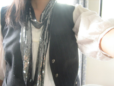
Plus she was wearing these amazing sequin pants so she inspired me to break out my sequin scarf. I bought this cool scarf from Luxe and Lavish a while ago never had the guts to wear it such a sparkly item during the day. Sometimes I just need a little encouragement!
Tuesday, April 20, 2010
Thomas Paul on Gilt
The other day I bought some Thomas Paul wares on Gilt. What is Gilt you ask? It is an "invitation only" online store that sells luxury women's, men's and home goods up to 70% off retail. Don't be scared of the invitation only, that means you just need to enter your email address and in a few days they'll email you back an invitation to join. Each day features different designers and at 12pm the items go on sale for about 24 hours. You have to be quick as things sell out quickly but the deals are amazing. Of course, I'm drawn to the home goods instead of the clothes... and Thomas Paul happens to be one of my favorites!
I bought these Calligraphy Flourish coasters for $10. The calligrapher in me just couldn't resist.
And I also bought these lovely melamine Flourish Bird Calligraphy dessert plates for $22. I was thinking I actually might frame them...
ala Sarah Richardson. She found these pretty bird plates at Pottery Barn and decided to use them as cheap artwork for her guest bedroom.
Monday, April 19, 2010
A Letterpressed Coliseum
Last week, Kathleen from Twig and Thistle posted about this amazing letterpress print by Cameron Moll. It was too beautiful not to share with you. It is a replica of the Roman Coliseum but it was designed entirely out of typeface. Characters and glyphs create each "building block". Isn't it absolutely amazing?! As a graphic designer I appreciate the amount of work that went it to it; 250 hours to be exact. I've never seen anything more intricate or detailed. This is a stunning piece of artwork reproduced in my favorite print form. Extraordinary.
Friday, April 16, 2010
Michaela and Joe's Wedding Invitation
I'm so excited to show you one of my latest projects... a wedding invitation packet for our dear college friends, Michaela and Joe. You might have seen her shower invitation that I created a few months ago and I also calligraphed the addresses on her invitations. Michaela and I used to work together at Modern Bride, so she has impeccable taste and had a clear vision of what she wanted from the start. She ordered her gorgeous invitation and response postcard from White Aisle, but she wanted to dress them up with a belly band and include an information and directions booklet.
The belly band incorporates the invitation colors of plum and gold. I used a beautiful plum satin ribbon and created a monogram that we will integrate throughout the rest of the wedding stationery. The monogram was printed on ivory paper and mounted on bristol board to give it more weight.
The information booklets contain restaurant suggestions, attraction information, a map and directions to the events. I created the map in Illustrator and did the rest of the layout in InDesign. The booklet was printed on ivory paper and cardstock and then I hand sewed them together using plum embroidery thread.
All in all, I'm so happy with the way they turned out. I loved emulating the look and feel of the invitation and incorporating similar elements throughout the stationery. Stay tuned for a few more special elements that I'm working on. I absolutely cannot wait to see it all come together at the wedding!
Tuesday, April 13, 2010
Votes Needed!
Hello readers, I was wondering if I could ask for your help.
My sister-in-law and her family have entered DIY's Desperate Landscape Contest and they need your votes! They've nicknamed their yard "The Burren" Gaelic for "great rock" and you can tell from this picture that they're dealing with not just rocks, but boulders! They've worked so hard on renovating their house so it would be great for their yard to reflect those changes as well. Please give them a five star rating for the truly worst yard! Click HERE to view their video and to vote. Thanks so much!
**UPDATE... Aideen just got a call back from DIY. They want more info and video footage of the front yard! She's beyond excited! Keep up those votes!**
Monday, April 12, 2010
I'm Intrigued...
by this Logan Coffee Table by Z Gallerie. Unfortunately Mike and I are still an "eat-in-front-of-the-tv" family so this coffee table might work perfectly for us. I love the clean, modern lines and how by pressing the table top, it pneumatically rises up to 30 inches. No more hunched dinners over the table... we could be thisclose to eating like civilized people!